5 min read
This post was written by Pierluigi Cau and Philip Norman of Mesosphere.

How do you visualize 50,000 containers launching in 90 seconds? For our MesosCon '15 keynote, we set ourselves a challenge: We wanted to show that our customers can achieve "hyperscale," and we wanted to do it live on-stage using the giant display screens.
Together with our friends at Verizon Labs, we came up with the idea of using Mesosphere's Marathon to launch thousands of containers per second. We decided to launch 4 microservices on a 24,000-core cluster, then use Marathon to scale these up to 50,000 instances in less than 90 seconds.
However, while scaling thousands of containers in such a short amount of time is an incredible technical feat, the output from such a demo risked being very dry visually. Visual representations of load tests normally involve a histogram or a graph of performance over time. We were determined to raise the bar and produce some great stage theatrics with what we called the "Hyperscale Visualizer."
Designing at Hyperscale
We had done visualizers before. At the //Build 2015 keynote in April, we collaborated with the Microsoft Azure team to present a DCOS visualizer as part of Azure CTO Mark Russinovich's keynote. This visualizer showed Marathon launching 2,000 Docker containers in real time on an Azure cluster, by displaying each container to a square in a grid.
[caption id="attachment_3263" align="alignnone"]

//Build 2015 keynote scaling demo.[/caption]
But in the six months since //Build, Marathon and Mesos had come a long way. The huge progress in both projects allowed us to scale our ambitions by a factor of 25.
However, being able to work with a larger number of instances also meant having to take a completely different approach from a design point of view. The first question we needed to answer was how we would represent 50,000 tasks coming to life in under 90 seconds.
We explored several possibilities. The main objectives were to demonstrate the speed and scale at which Marathon would spawn the tasks; at the same time we wanted to provide a view of these tasks being launched on a large number of coordinated machines. Looking at Marathon logs from our testing cluster, we knew that these tasks would come up in bursts of up to 1,000 tasks per second. We needed a new kind of visualizer to capture the speed and scale at which Marathon performs its orchestration.
We quickly abandoned the idea of using progress bars or gauges, as they just couldn't capture the energy of thousands of tasks spawning up in full spate. We needed a UI that was simultaneously accurate and beautiful, capable of showing tens of thousands of tasks on-screen in a way that is memorable and visually arresting.
We wanted something truly inspiring, unique and daring. And it had to run in the browser.
Space is the Place
Outer space—galaxies, solar systems, star fields—is a major design motif here at Mesosphere. We use them on our posters and the names of our conferences rooms. Hence, it didn't take too long for us to come up with the idea of visualizing tasks as a cloud of particles, orbiting in space and forming a galaxy.
The Observation Deck was born.
[caption id="attachment_3261" align="alignnone"]

The Observation Deck running in Chrome.[/caption]
The Observation Deck is a 3-D galaxy where each asteroid represents a task. It polls Marathon's REST API and detects when a new task enters the running state. When that happens, a corresponding particle is generated, fired off from the center and shot through the orbits until it reaches its final position in the galaxy.
We explored assigning particle colors and position based on the task's health, age and other criteria. But ultimately we returned to random positions and a color-code representing the app to which the task belongs. This was an effective way of adding visual variety while avoiding unnecessary cognitive load for the audience. After all, this demo was going to be shown in a large room and viewed from a distance, and the total running time would be only a few minutes.
The Observation Deck UI consists of a three-dimensional galaxy (essentially a particle cloud with custom shaders built using the awesome ThreeJS library) and a series of on-screen widgets, which we refer to as the HUD. The HUD consists of the total number of running containers, a stopwatch to measure the total amount of time until our target is hit, the rate of containers spawned per second and a few controls.
The toggles on the left allow the user to turn apps on and off the screen individually, while the little airplane icon in the bottom right corner triggers an "autopilot" mode, in which the camera moves in a scripted loop. The user can also control the camera manually with the mouse or via hotkeys to move through pre-selected positions. Additionally, it is possible to toggle between a grouped and freeform view of the tasks by using the button in the top right corner.
Looking at a screenshot doesn't really do justice to how stunning this is in motion.
[embed]https://www.youtube.com/watch?v=YwuZVB7PVRs[/embed]
It's pretty impressive to see up to 50,000 particles running in a 3-D scene inside a browser at a solid 60fps on an off-the-shelf laptop.
Fast-forward to the MesosCon keynote. When it was finally time to pull it off on stage, the Observation Deck connected to the running instance of Marathon and started polling the data from a remote datacenter of about 500 nodes, and began showing each of the 50,000 tasks as they spun up. As planned, we hit the target in about 1 minute and 12 seconds.
Judging by the reactions, it was a success:
[embed]https://youtu.be/_tfneEN0uPs?t=6m35s[/embed]
[embed]https://twitter.com/adrianco/status/634766503989104641[/embed]
[embed]https://twitter.com/fishermanchips/status/634766387471380481[/embed]
[embed]https://twitter.com/yasumoto/status/634767114973388801[/embed]
Conclusions
Building the demo was definitely challenging, especially because it would run live on stage, which is almost always a big bet against Murphy's law! But we wouldn't have settled for anything less impressive than that.
It was also a great opportunity to test Marathon under extreme conditions, and the results tell us that we really are building something amazing.
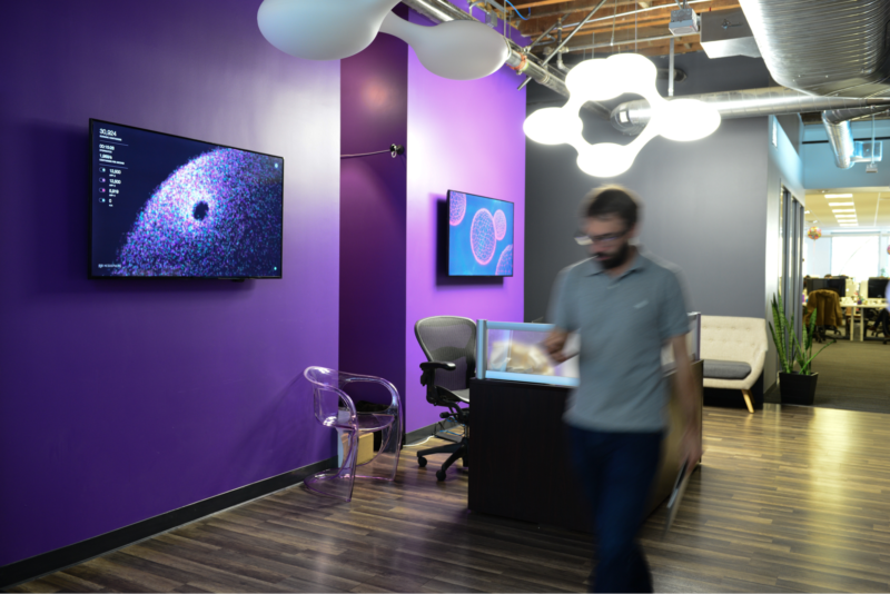
If you want another chance to see the Observation Deck in person, come visit our office in San Francisco—you will find it on our lobby screen.
Thanks to the whole Mesosphere team who made this possible and special thanks to Verizon Labs for its support.
