I love reading about how other Design teams are working together and what tools they're using. It's reassuring to know teams you admire and respect use the same tools you do. It's also usually a trigger for me to try some other tools that either I haven't heard of or that I've been meaning to look into and haven't gotten around to it.
Designing for the enterprise has some connotations. Due to our real world experiences we have grown accustomed to enterprise software having poor UX. I'm not going to call out anyone here but think about internal tools you use at work like payroll, HR portals, intranets, proprietary software… I'm sure you can identify a bunch of tools that you use daily with poor UX. And, if you're like me, at some point in the past you've thought to yourself "what were their designers thinking here?" or "what tools are they even using to design this?". There can be an assumption that the companies responsible for enterprise software are using legacy design tools or worse, aren't investing in a team to own the user experience.
In recent years that has changed.
The enterprise has embraced UX and it's a lot easier to convince your boss or executive team that investing in UX makes a difference. Conferences like
Enterprise UX are bringing together creative minds of the enterprise design world to share insights, experience and buy-in tactics that work. Companies like
IBM and
Salesforce are investing in design and
positioning it as a competitive advantage. Design tools are
targeting the enterprise and building in more and more
enterprise features.
The market for enterprise software has evolved. Companies realized the productivity drag of poor software, and users, as their sophistication grew, were less willing to put up with bad design. Enterprise software companies found themselves losing customers because of their poor design. This "consumerization of IT" has accelerated as people who have been steeped in digital technology since childhood (read: "millennials") have entered the workforce, and they have higher expectations from technology than those who preceded them. This means some of the biggest investments in design are happening on the enterprise side. — Org Design for Design Orgs
Design at Mesosphere
At Mesosphere we have a small team of Designers. We're a 5 year old company. We make
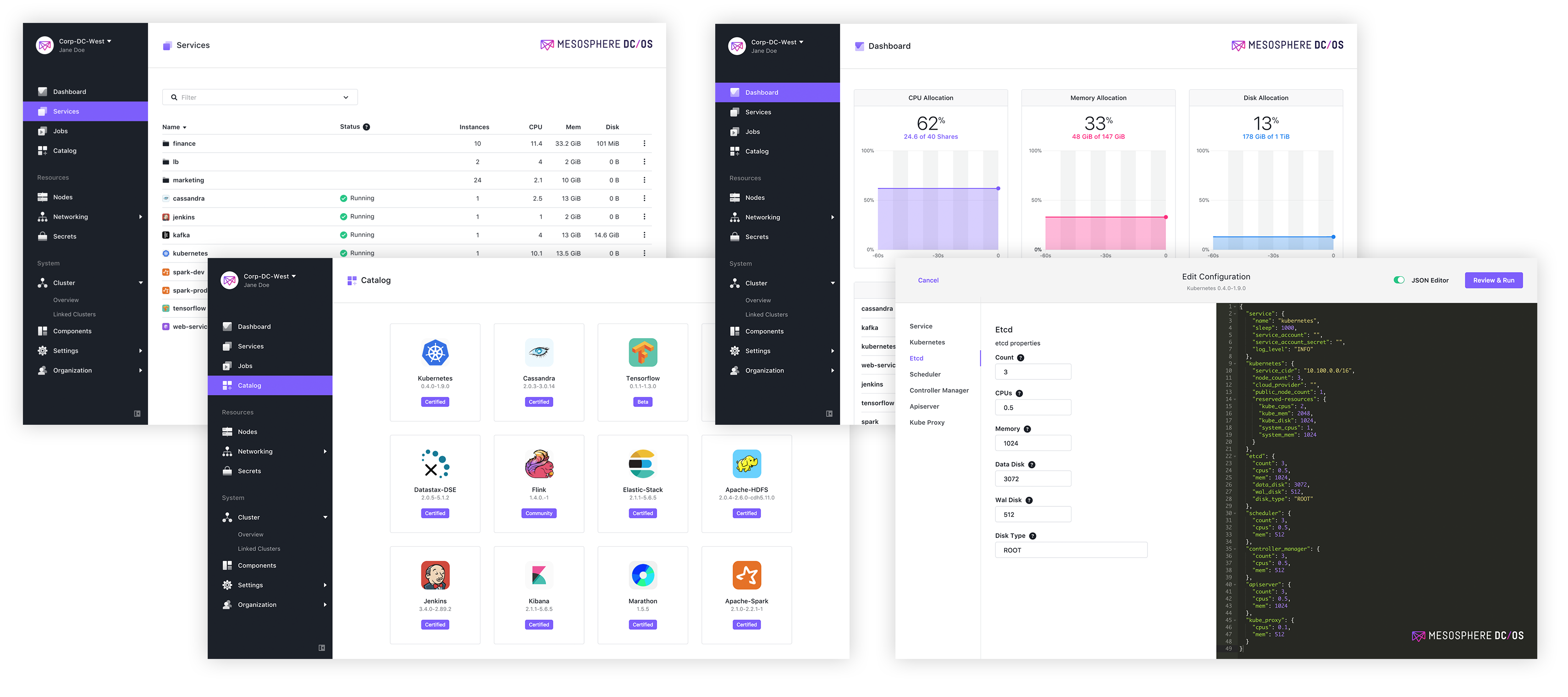
Mesosphere DC/OS. Software that
30% of the Fortune 50 and companies like Verizon, Uber and Netflix use to manage their workloads, containers and big data services. We get to design software for companies that play a part in our daily lives today, or will in the future, including
big banks, autonomous cars and artificial intelligence.
We use a modern design stack. As a team these are the tools we are encouraged to use day to day. We are always open to evaluating new tools that a team member proposes and deciding as a team to switch or embrace a new tool, but it is important that for the most part we use the same tools so we can share work, collaborate and switch projects when need be.
Non-Tech Tools
Sketch
We use
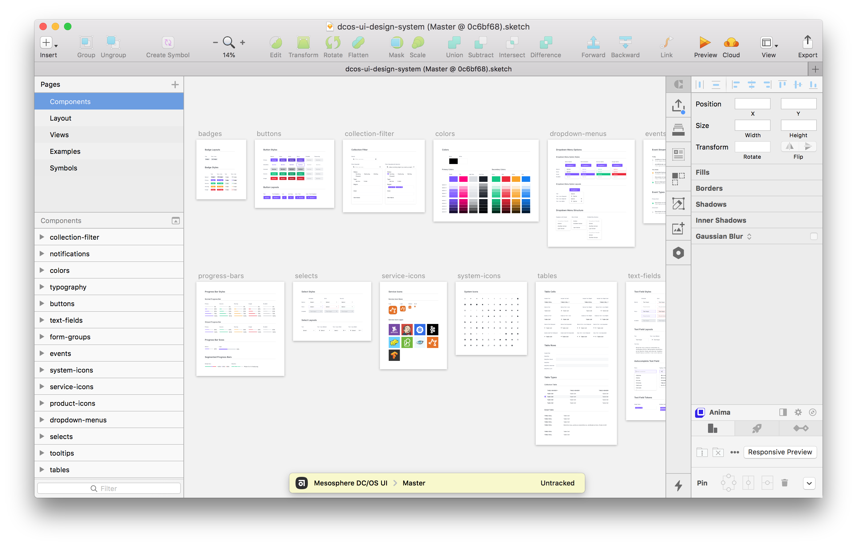
Sketch by Bohemian for interface design. We have UI Kit libraries for both our product and
website which help us move fast with prototypes and maintain consistency.
Abstract
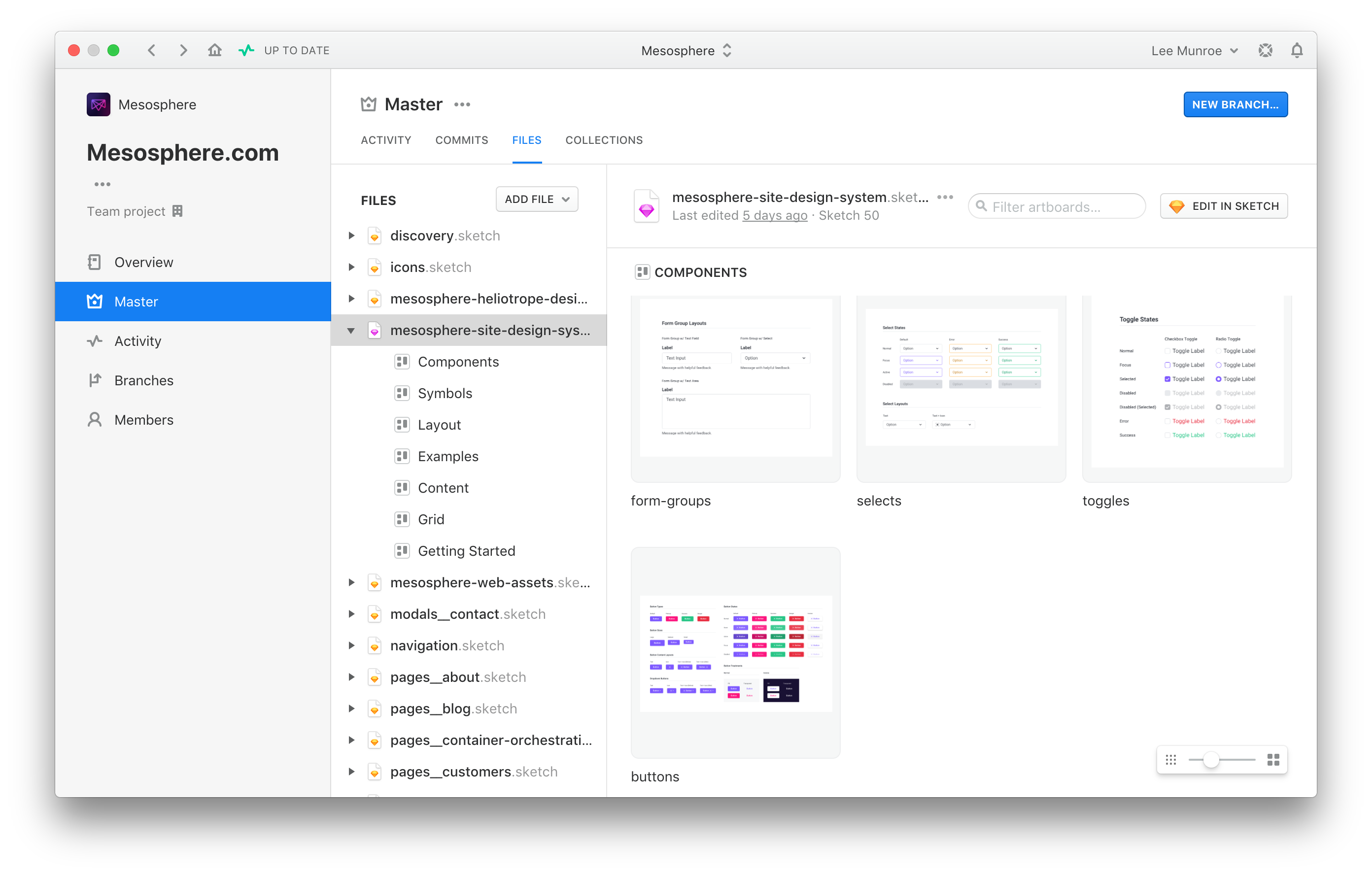
Abstract is our tool of choice for Sketch version control. For new projects or iterations we'll create branches before merging them back to master. It gives us a nice central hub and single source of truth for design files.
Lingo
While we use Sketch and Abstract to maintain our UI Kit libraries,
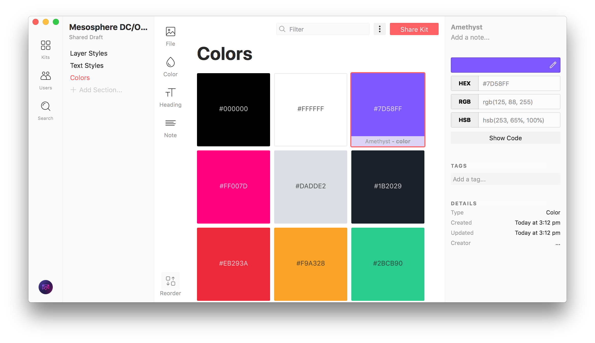
Lingo helps us manage our type, layer styles and colors.
InVision
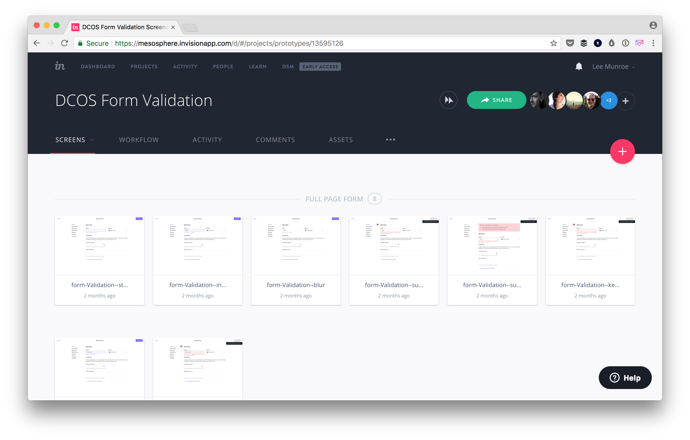
InVision is our prototyping tool of choice. We'll design in Sketch then upload to InVision, create hotspots and share. We use
Craft to help facilitate that relationship between Sketch and InVision.
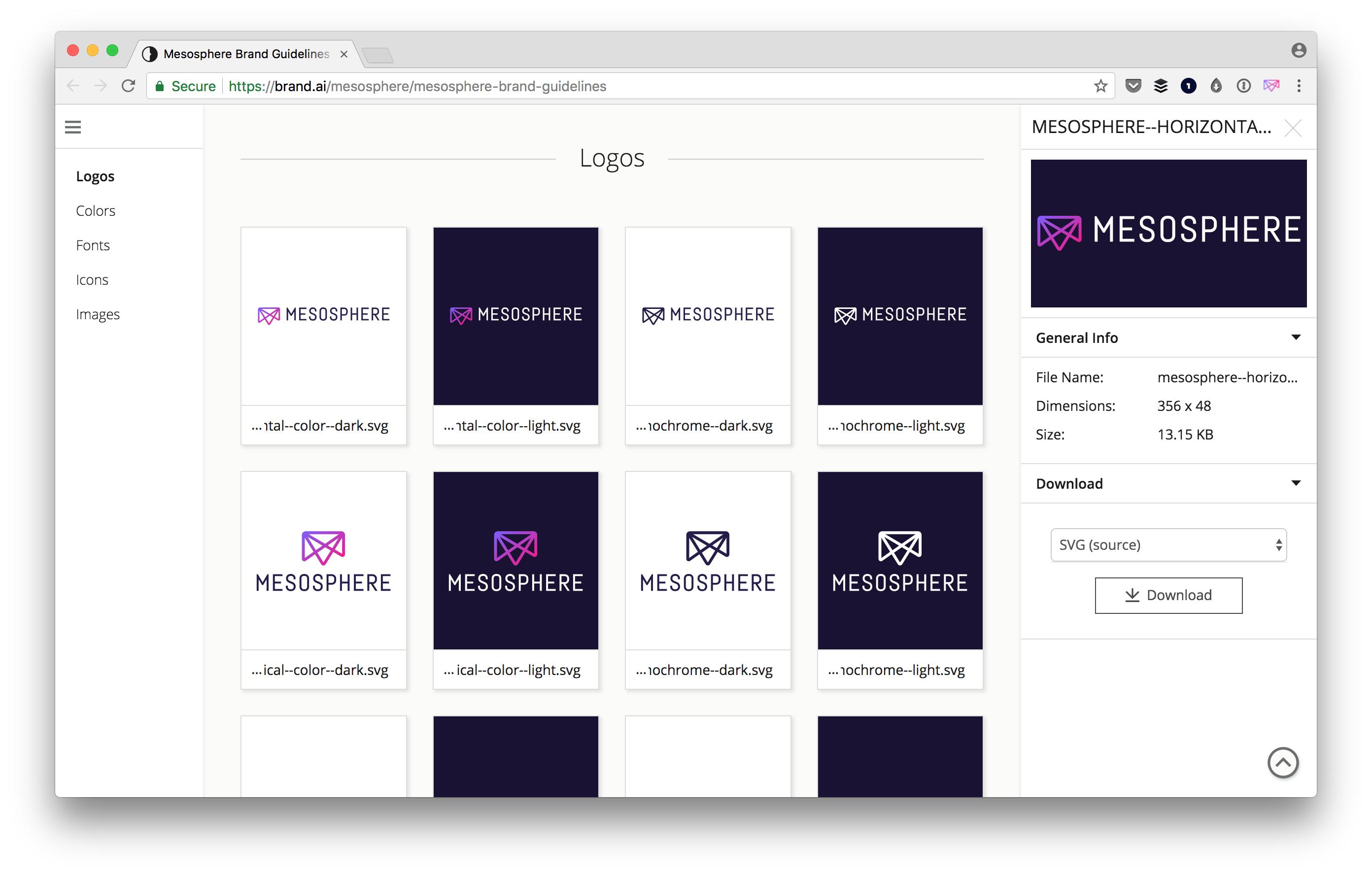
InVision also acquired Brand.ai which we use to manage our source of truth for
brand guidelines and assets. This is extremely useful internally when other team members are looking for the right logo or color value to use.
VS Code
On the Design team we don't code new product features, but we do jump in and help with
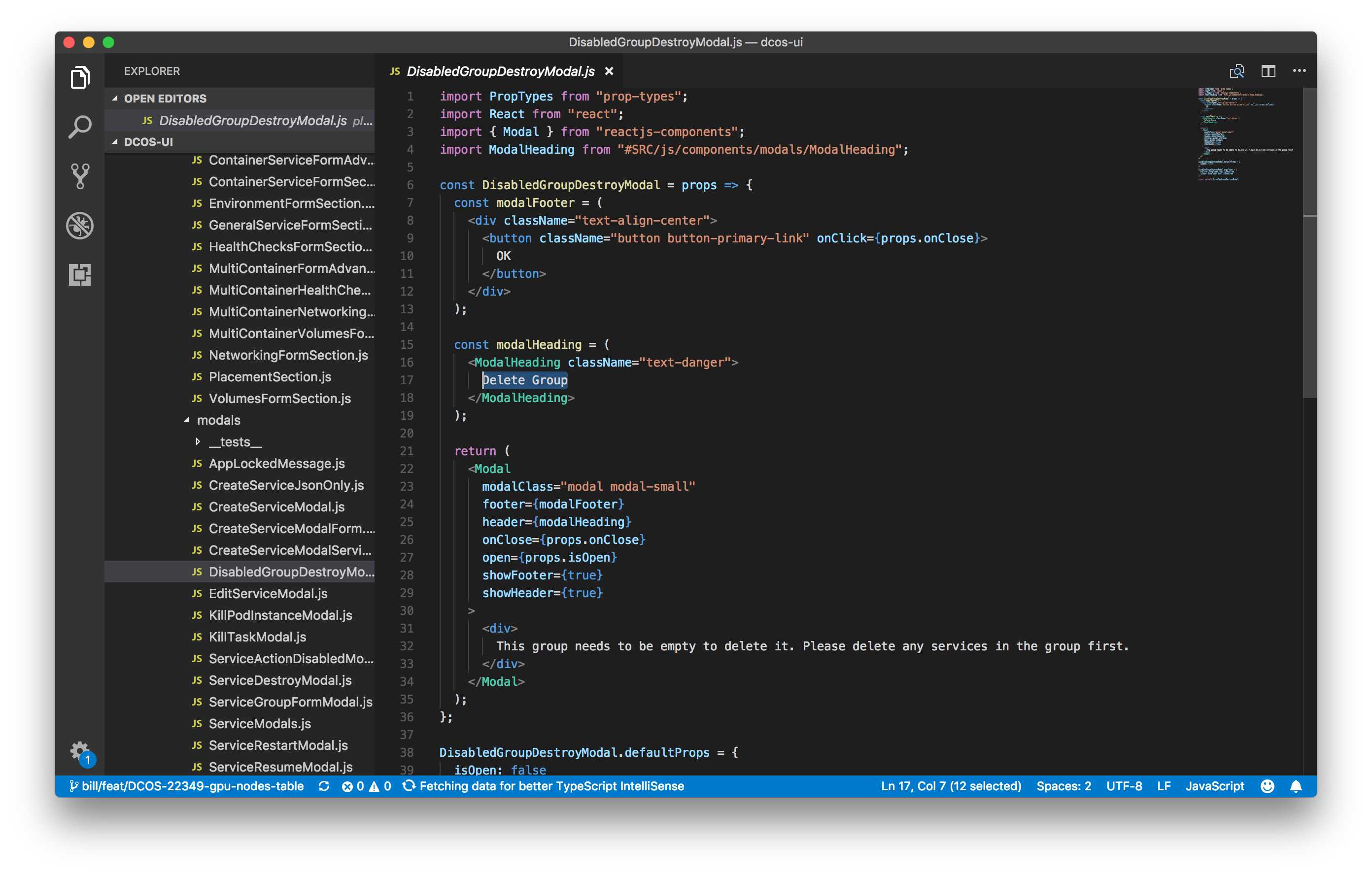
component styles, copy and UX issues. When we do write code,
VS Code is the editor of choice across the team these days. Our repos are stored in GitHub (most of which are
open source).
Adobe CC
While we use Sketch for interface design we all have a license for
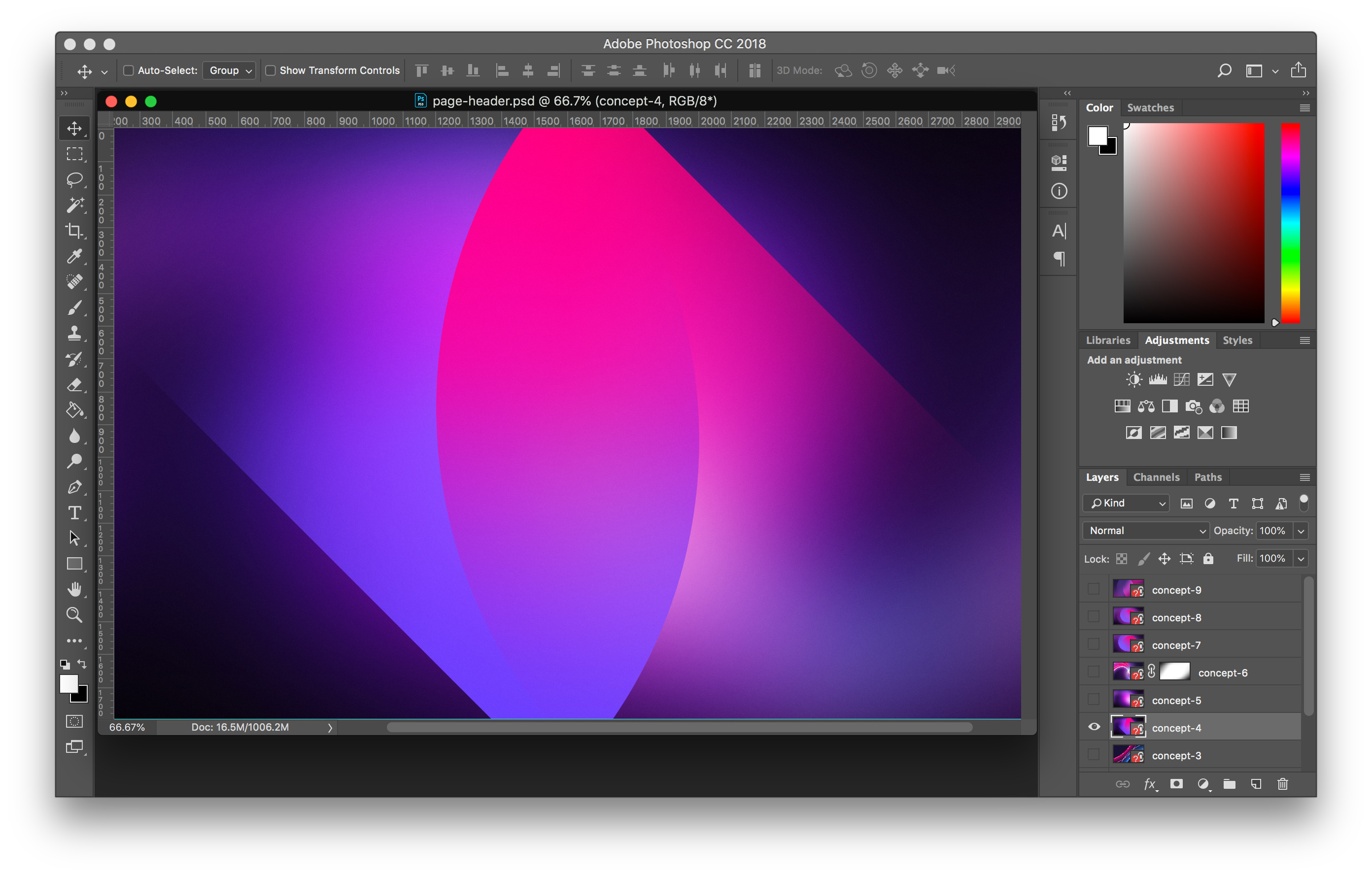
Adobe CC. We'll use Photoshop for photo editing or large graphics, Illustrator for illustrations, icons and print design, as well as InDesign for digital and print documents.
Slack
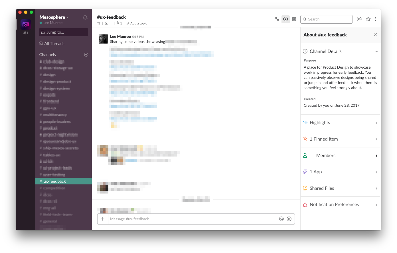
Slack is the communication tool of choice at our company. We have a private design channel for internal team discussions and critique, a public design channel where we'll share stuff with the company, and we'll setup temporary channels for individual projects to help facilitate the feedback cycle with stakeholders.
JIRA
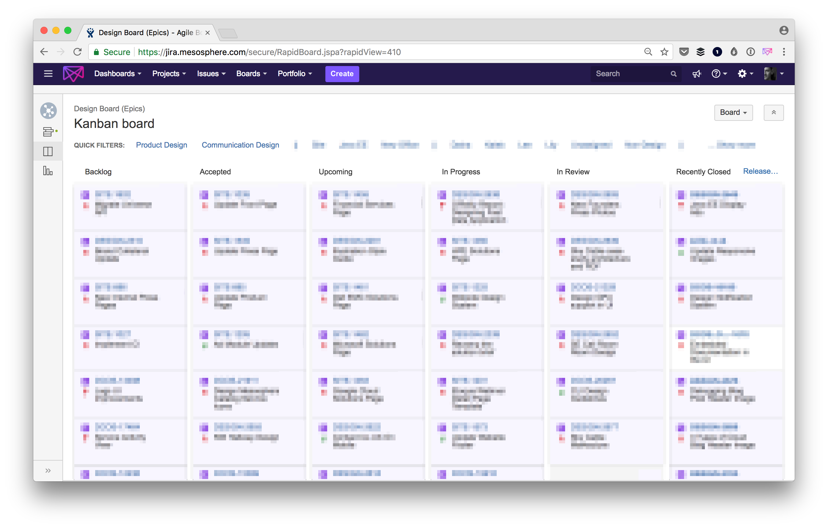
JIRA is the project management tool of choice at our company. We create Epics for projects and then tasks under that Epic to help deliver it. These Epics are usually tied to Product Features on the product backlog and Engineering Epics that our engineers create to deliver a feature. While each team member is responsible for managing their own tasks, this Kanban board gives the rest of the team (and company) transparency.
Confluence
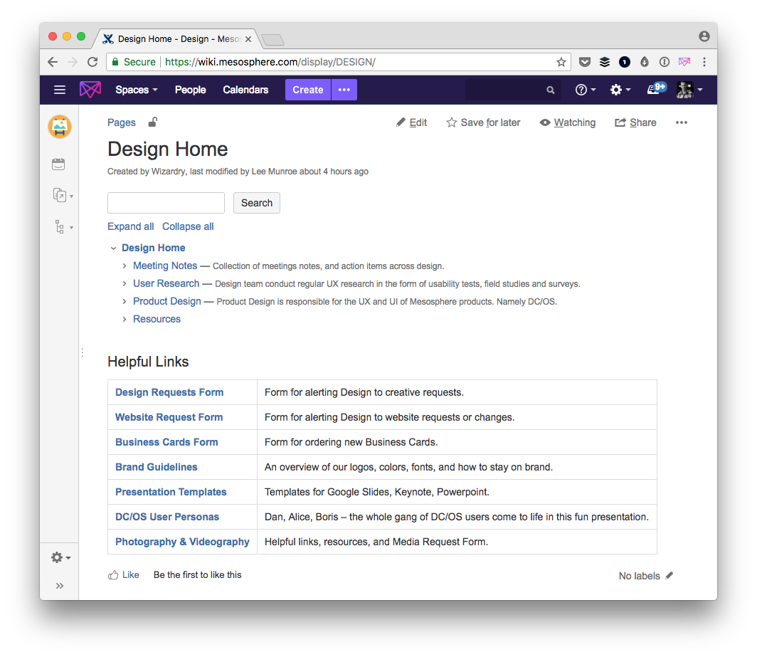
Confluence is the Wiki tool of choice at our company. We have a Design space where we document a lot of things like our workflows, recruiting process etc. For each project we'll also create a Wiki page where we document learnings as we go and the final prototype, user stories and acceptance criteria.
G Suite
We use
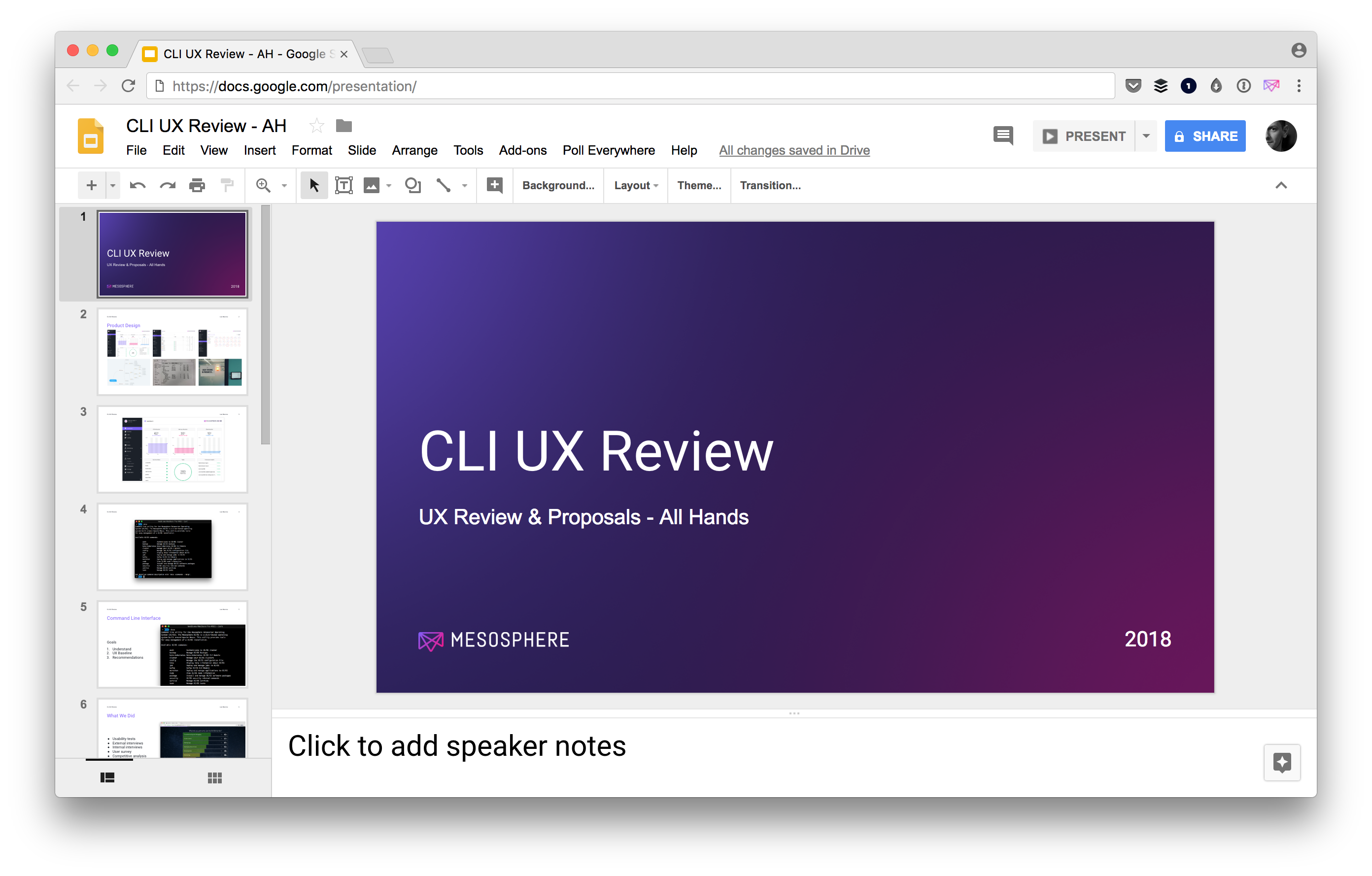
Docs to collaborate on ideas and content e.g. API design docs, this blog post. We'll use Presentations to help facilitate and pitch our design ideas and solutions. We use Drive to share files and design resources. Using Google's suite of tools enables us to collaborate and access from anywhere rather than sharing hard copies back and forth.
Dropmark
We use
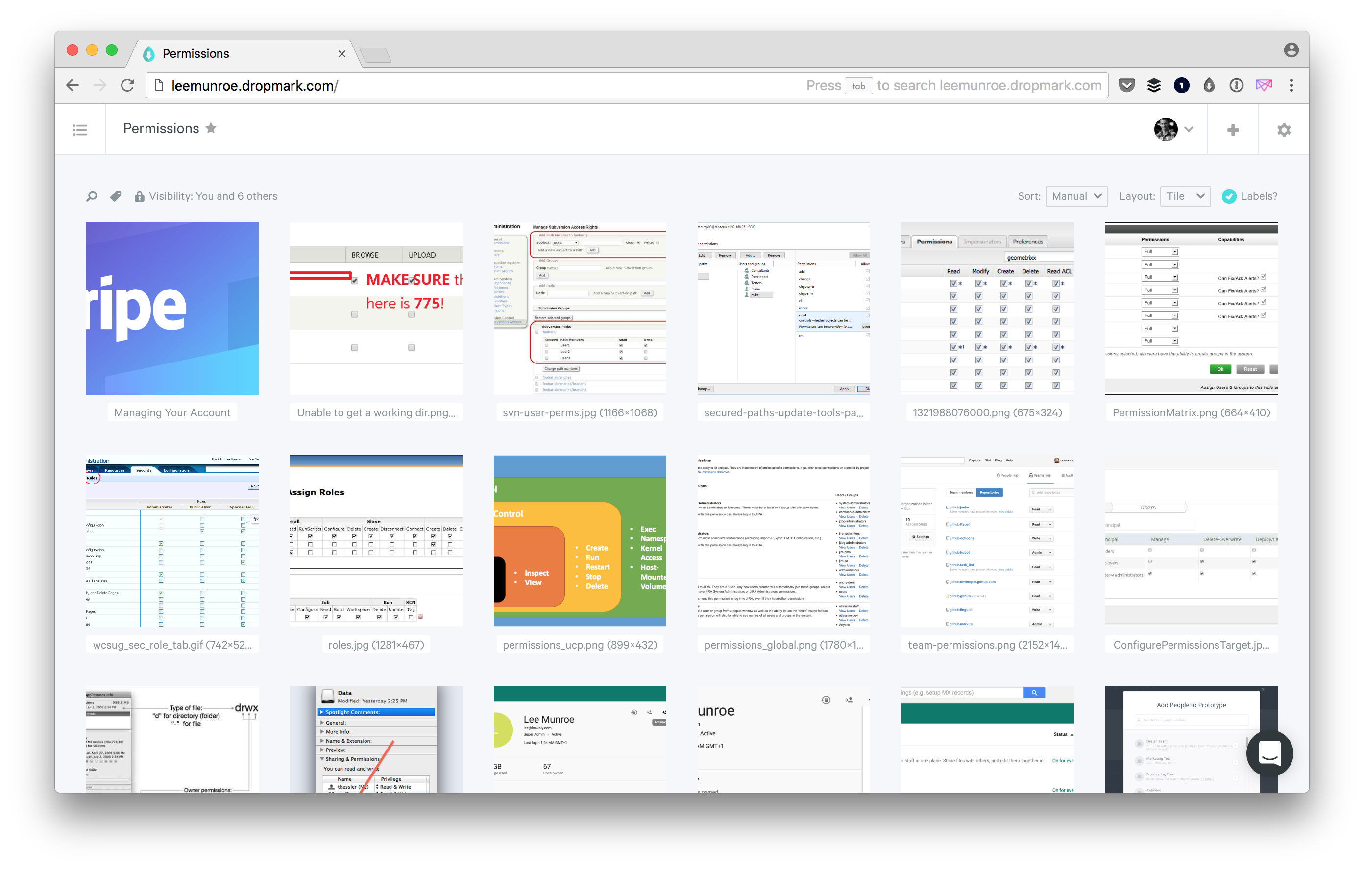
Dropmark to gather inspiration and build a knowledge base over time. Dropmark has a handy browser extension for adding websites and images. We also use this for our weekly "designspiration" or show and tell, where we'll collect resources we want to share with the team in our weekly design sync.
Cloudapp
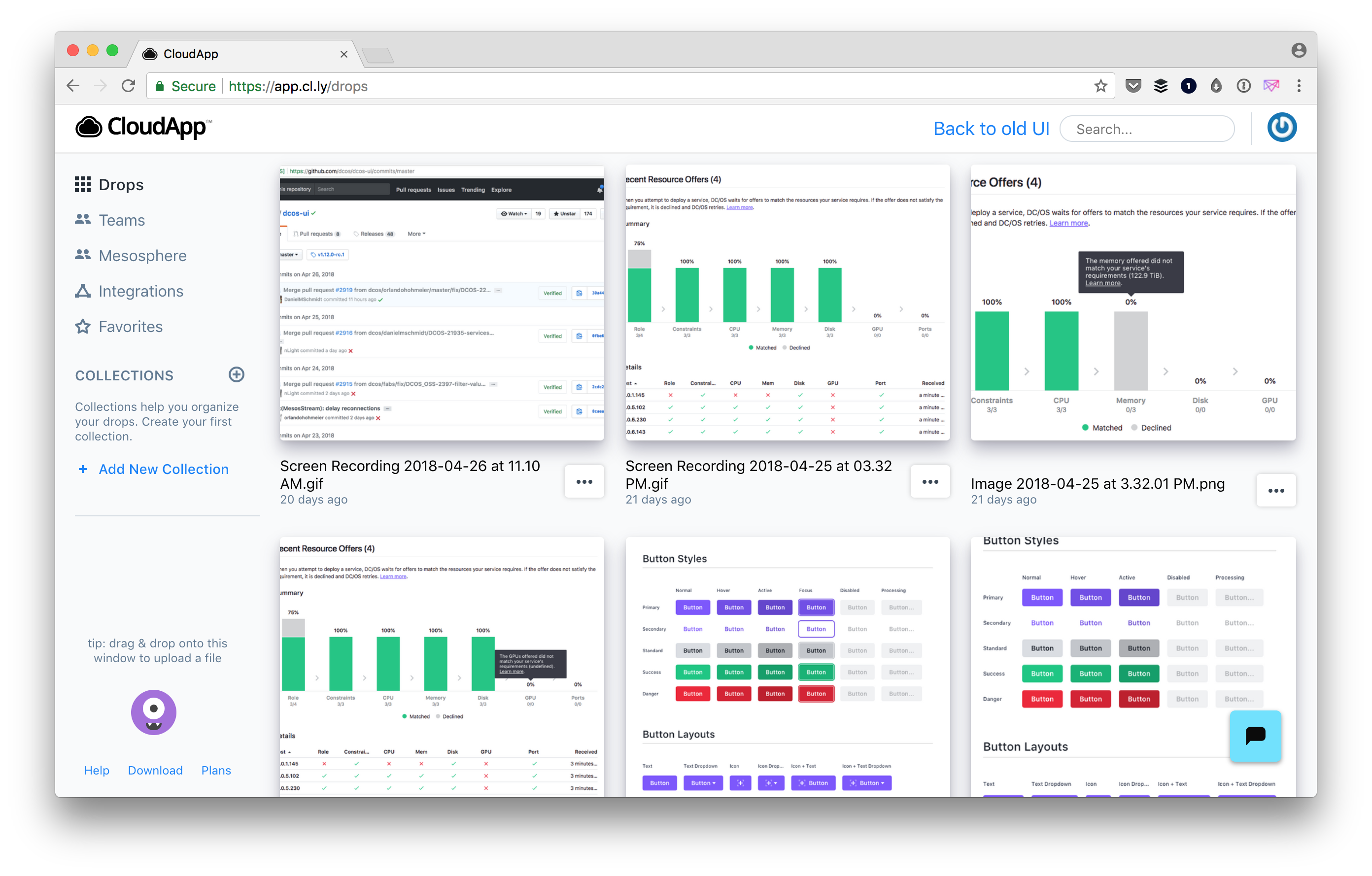
Cloudapp is great for sharing screenshots and gifs or movies of your screen. Instead of creating a design in Sketch sometimes it is easier to inspect element, take a screenshot, share in Slack and annotate it with Cloudapp.
Screenflow
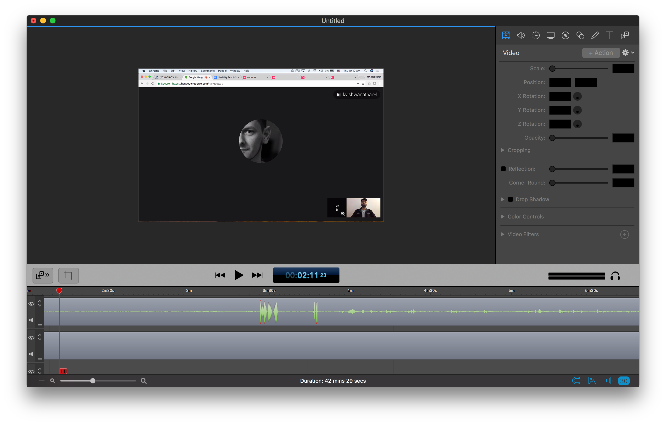
For higher quality screen recordings we use
Screenflow. We use this in user testing sessions to record the session then upload the videos to Google Drive, which are then shared as part of our user test reports.
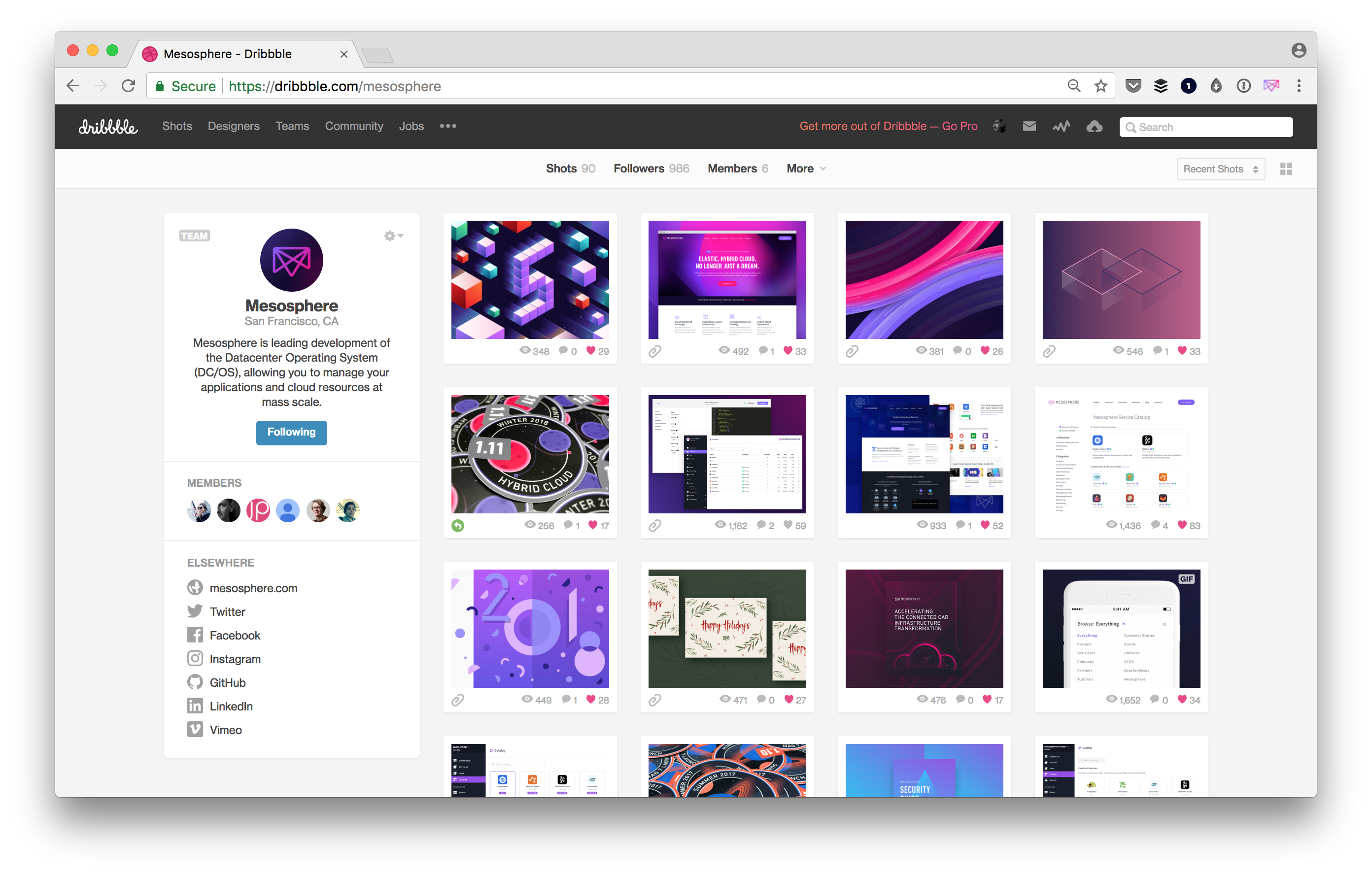
Dribbble
We use
Dribbble to gather inspiration and to share work we've designed. Sharing helps us celebrate small wins and we've also found it useful when hiring.
Future Tools to Evaluate
While these are the tools that we use today, there are a lot of tools that are on our radar. We keep an eye on these, and had some members of the team conduct lunch and learns about them, but we haven't decided to officially switch to just yet.
